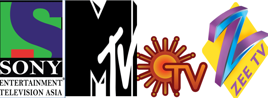
There was a time (15, September 1959) when India witnessed its first ever experimental television broadcast on the only channel – Doordarshan! Now, we have at least 900 channels from India and the world broadcasting around the clock in almost 26 primary Indian languages!
It is now time for us to rejuvenate your memory regarding TV channels and their history in India. Do you remember that some Indian TV channels changed their logos from their original ones? Some had major takeovers and some changed their names as well!
Let’s take a look and see if you can recollect these changes:
1) Star Plus
- The channel was originally launched in India on 21st February 1992 and used to telecast English shows from the UK and the US while Zee TV telecast content in Hindi.
- After STAR got acquitted by News Corporation, Star Plus became a Hindi language channel and a new channel Star World was born for English content!
- In 2010, it changed its logo into a ruby crystal star from the original flat blue star within a blue box. They used a tagline called ‘Rishta Wahi Soch Nayi’ to market this change. In 2016, they again enhanced the logo with better graphics.
2) Sony TV
- This channel started in October 1995 and features Hindi content since its inception. Previously, movies were shown on Sony Entertainment Channel, but owing to more public demand, they launched a new channel called Sony MAX which telecast only Hindi movies and Hindi-dubbed movies of regional and foreign origin.
- Initially, the logo from 1995-2007 was a purple ‘S’ with a green background and a red square on its bottom end. From 2007–2011, the logo had a black bounding box and all the lettering came at the bottom. From 2011-2016, the ‘Sony’ word again went back to the top.
- It changed its iconic ‘S’ logo on 19 November 2016 (on its 21st anniversary) to a golden ‘S’ with the tagline ‘Yes Dus Saal Aapke Naam’ (These 10 years, dedicated to you). The red square is now orange.
3) Zee TV
- Zee Network was launched in India in 1992 and has catered Hindi content via Zee TV, it’s parent channel. They have had 7 major logo changes in these many years!
- From a 3D-ish ‘Z’ logo that kept experimenting with colors from 1992 to 2005 to a slightly slanted ‘Z’ logo from 2005-2011 – Zee has tried it all!
- From 2011-2014, the channel had a really beautiful blue ‘Z’ logo with a white pinstripe in the middle of the letters. The tagline they adopted was ‘Ummeed Se Saje Zindagi’ (Life, Decorated With Hope). From 2014 to 2017, they did away with the old tagline and came up with a new one called ‘Har Lamha, Nayi Ummeed’ (Each moment, new hope)
- Finally, in 2017, they came up with a completely new identity in an orange bubble with a simple ZEETV in the center corner of the bubble. The new tagline was ‘Aaj Likhenge Kal’ (Scripting Tomorrow Today).
4) Sun TV
- This iconic Tamil language satellite TV channel was launched on 14 April 1992.
- Once, Sun TV was adjudged as the most-viewed entertainment channel in India!
- The original logo of the channel from 1993 to early 2000s was simple with a ‘SUN TV’ monogram and a sun in the backdrop.
- The current logo is a radiant sun accompanied by ‘TV’.
5) MTV India
- MTV India (Indian version of MTV) was launched in India in 1996 to cater music, reality, and youth culture programming to the Indian masses.
- The channel’s logo initially had a black M with a ‘TV’ inscribed on it and MUSIC TELEVISION written at the bottom.
- The current iteration of the logo eliminated the ‘Music Television’ tagline to reflect the fact that the channel does more than just music-related programming.
6) Star News (now ABP News)
- The Star News Channel was initially a part of the STAR network until 2012.
- It had three logo changes during that period. 1991-2001 had the original logo in blue and yellow with a star in the left corner. From 2001-2012, the logo got a more suave shape, a white background and used the word NEWS in English and Hindi as well!
- In 2012, the channel was bought by Ananda Bazaar Patrika and renamed to ABP news. The logo was similar to the old one, but was now vertical, not horizontal and had an upward-pointed arrow-head that resembled an ‘A’.
- In 2016, the channel refurbished the logo with a golden red combination in which the ‘A’ and NEWS background became red and the logo motif became golden.
7) SAHARA MANORANJAN
- Sahara Manoranjan (Sahara One from 2004-2016) is a channel which was owned by Sahara India Pariwar.
- The channel was launched in 2000, but it was renamed to Sahara One in 2004.
- The channel’s logo had gone through 4 iterations in its lifetime. The first one had the Ashoka Chakra made of a human chain and was branded Sahara Manoranjan. The 2nd, 3rd, and 4th iterations had different color combinations of Sahara One.
- The channel officially shut down in 2016 owing to Sahara Group’s losses and court battles.
So, you can see that India has grown leaps and bounds in the broadcasting domain too! Indian television has gone through so many changes that you probably forgot many of these logos, didn’t you?
Let us know in the comments if you loved this article!
